What is hAppy?
hAppy is an App.net (short ADN) client for iPhone (You can download it here). I joined ADN because Marco Arment tweeted that he backed the project and it sounded very interesting. The idea to have an infrastructure with which many different clients and moreover a lot of new and exiting ideas could be realized fascinated me. I thought about what people did with the limited Twitter API. The many different clients and ideas within the clients. What would happen if they where given an API with much more possibilities.
Here is what I learned in making hAppy accessible.
Accessibility Challenges
Apps for iOS can easily be made accessible. For a start I recommend to read the great articles by Matt Gemmell and Keith Harrison.
Accessibility is not a feature, moreover missing accessibility is a bug.
The Easy 95%
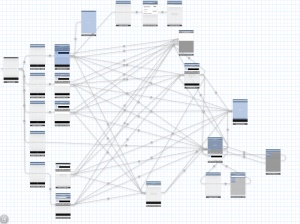
hAppy was developed with the use of storyboard. (By the way, I strongly recommend not to use storyboard. At the current stage it is a pain in the ass.) The picture shows how complex storyboards can get for such an small app like hAppy.
But on the plus side, using storyboards roughly 95% of the accessibility implementation can be made with Interface Builder. You select the object you want to make accessible and set the accessibility label, the accessibility hint and the accessibility traits. The rules you should follow when implementing those are in detail described by Matt Gemmell.
Real World Example: The Reply Button
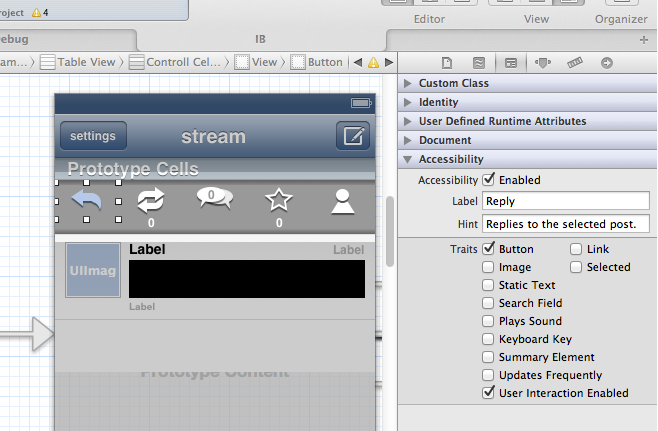
In hAppy one can select a post to show actions in conjunction with the selected post (like reply and repost). These action buttons are custom buttons with images and therefore not accessible by default. Here is what I had to do to make the reply button accessible:
Open the storyboard in Interface builder. Select the reply button and open the identity inspector. Set the accessibility label to “Reply” and the accessibility hint to “Replies to the selected post.”. The accessibility traits are already set because the button is an instance of UIButton. Don’t forget to make accessibility enabled if it isn’t already.
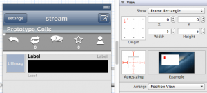
The following pictures shows how this looks like in Xcode 4.5.
The rest of the action buttons can be made accessible with similar steps. But how do visually impaired users get informed that the buttons appeared? Apple implemented a notification one can send to inform the system about those changes.
UIAccessibilityPostNotification(UIAccessibilityLayoutChangedNotification, nil);. When the system receives this notification an acoustic signal informs the user. In hAppy I call this function after I have inserted or removed the cell with the action buttons from the table view.
Most of the UI has been made accessible using this approach. Let’s now talk about the remaining 5%.
The “Hard” 5%
The Post Text
The post texts in hAppy are drawn with Core Text and NSAttributedString because the links, usernames and hashtags should be highlighted and clickable. Unfortunately this means the post texts are not accessible by default. But as it turned out I only had to implement one line of code to change that:
self.accessibilityValue = self.text;
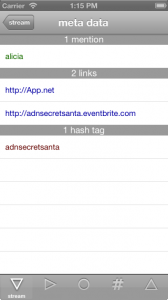
But there is a problem with the clickability of the post text elements. Visually impaired users navigate between clickable elements with swipes (Go, try it!). I could have implemented all the clickable elements as attachment to the post. The visually impaired user could then have accessed the clickable elements by swiping though them element by element. I discussed this implementation with Marco Zehe, an accessibility evangelist and QA engineer at Mozilla, who was so kind to test hAppy. He pointed out that this could be frustrating as the user should have to swipe through all those elements even if he/she would only want to reply to the post. Marco had the idea to make the clickable elements accessible in the action menu. An additional button would have destroyed the UI and therefore I have implemented an invisible but accessible button, which can barely be seen in the picture.
The selection of this button loads a table view with three sections containing the clickable elements. I have added the information about the number of the clickable elements in each header of the different sections.
But there is another problem with the clickable elements in the posts. If VoiceOver is active one can select the text of a post and VoiceOver (or Siri) reads the text. A double tap anywhere on the screen should then open the action menu for this post. But when the user double taps, VoiceOver simulates a tap in the middle of the selected item. Some posts have a clickable element at this position. As a result, instead of showing the action menu, a profile page or a web page is shown. UIAccessibility allows the developer to change this simulated point but this doesn’t help in this case as the clickable elements can be anywhere in the post.
To fix this issue I use the focus feature of VoiceOver. VoiceOver sends a notification to the item which enters its focus and another to the object which leaves the focus. I use these notifications to set a Boolean property of the text view to reflect the focus of VoiceOver. With this addition I can disable the clickable elements in the post when the focus is on the post text.
A post in ADN is not only the text. The user also wants to know who posted and when. This is straight forward in VoiceOver. With the information from the API the app creates a label for the post cell. The time information is parsed to time since post creation. In the user interface I use the abbreviations m, h and d for minute, hour and day. For VoiceOver I convert this to the corresponding words. As a feature I also give the information with which client the post was created. Therefore a typical post cell information could be “dasdom posted three minutes ago via hAppy.”. A swipe to the right would then result in VoiceOver selecting the posted text and reading it aloud.
The Profile Page
The first version of the profile page included a floating view with the cover image and action buttons (like follow, mute, show followers) on top of a table view. As it turned out, in this implementation the profile wasn’t accessible at all. VoiceOver wasn’t able the select the action buttons on the floating view one after another. It selected the first action button and switched with the next swipe to the last element of the table view. After I changed the floating view into a table view header everything was fine. The drawback is that I had to change the design to make the app accessible. But I already have another idea how I can accomplish the desired design and keeping the accessibility. The idea is to put the action button in a table view section header. I will try this soon and update this section if the result is what I expect.
I have seven action button on the profile page. To keep the UI clean they are laid out in a horizontal scroll view. The design does not allow to inform the user that there is a scroll view. Therefore I have added a button in the navigation bar with toggles the scroll positions of the scroll view. This has the big advantage that it can easily be made accessible. The user interface changes when the button is selected. Therefore I call again the function UIAccessibilityPostNotification(UIAccessibilityLayoutChangedNotification, nil);.
Conclusion
Accessibility is not a feature, moreover missing accessibility is a bug. Most of it is quite easy to implement and it shouldn’t take much time (especially when you are using a lot of Apple provided user interface elements). And you get a bonus. If your app is fully accessible you can use UIAutomation to make automatic touch based tests of your app with Instruments. This helps to find bugs and make regression test of your user interface.
As a developer you should switch on VoiceOver from time to time and inspect your and others apps. Get a feeling what is important when you can’t see the user interface. Learn from others how they have mastered difficult accessibility tasks.
Tell other developers how easy it is to make apps accessible. Show them examples of accessible and not so accessible apps. Convince your boss that this is important and will help the company to become a good citizen in the app business.
Acknowledgements
I would like to thank Marco Zehe for testing hAppy and giving me a lot of very useful feedback and input. And I would also like to thank Matt Gemmell for testing and for the nice article about hAppy on his blog. I was thrilled and I am flattered!


Pingback: An overview of accessible app.net clients | Marco’s accessibility blog
Pingback: MyTaxi entwickelt sich zur Accessibility-Vaporware | Marco Zehe EDV-Beratung